Single Blog Rendering in VitePress with Tailwind Typography
Part of the series Create a Blog with VitePress and Vue.js from Scratch
Today, we will develop the page for reading a single blog article. This page will display the article's title and content, allowing us to delve into VitePress's Markdown rendering capabilities, the Tailwind Typography plugin, and code syntax highlighting.
Setting Up the Route
Note
Ensure that there are Markdown files in the src/blog directory. You can replicate them from the GitHub repository.
Initially, we need to apply the layout to every article. In each article within the src/blog directory, add the following to the frontmatter:
layout: blog-showNext, we need to create the page to display our article. In the .vitepress/theme/pages/blog, create a new file named BlogShow.vue. This file is located next to BlogIndex.vue created in the prior article.
<template>
  <Content />
</template>
Now, we must bind this page to the correct layout key. In the Layout.vue file, add conditional rendering based on the layout key in the frontmatter of the current page as follows:
<template>
  <div class="min-h-screen bg-[#FC88FF]">
    <main class="mx-auto max-w-screen-md">
      <BlogIndex v-if="frontmatter.layout === 'blog'" />
      <BlogShow v-else-if="frontmatter.layout === 'blog-show'" />
    </main>
  </div>
</template>
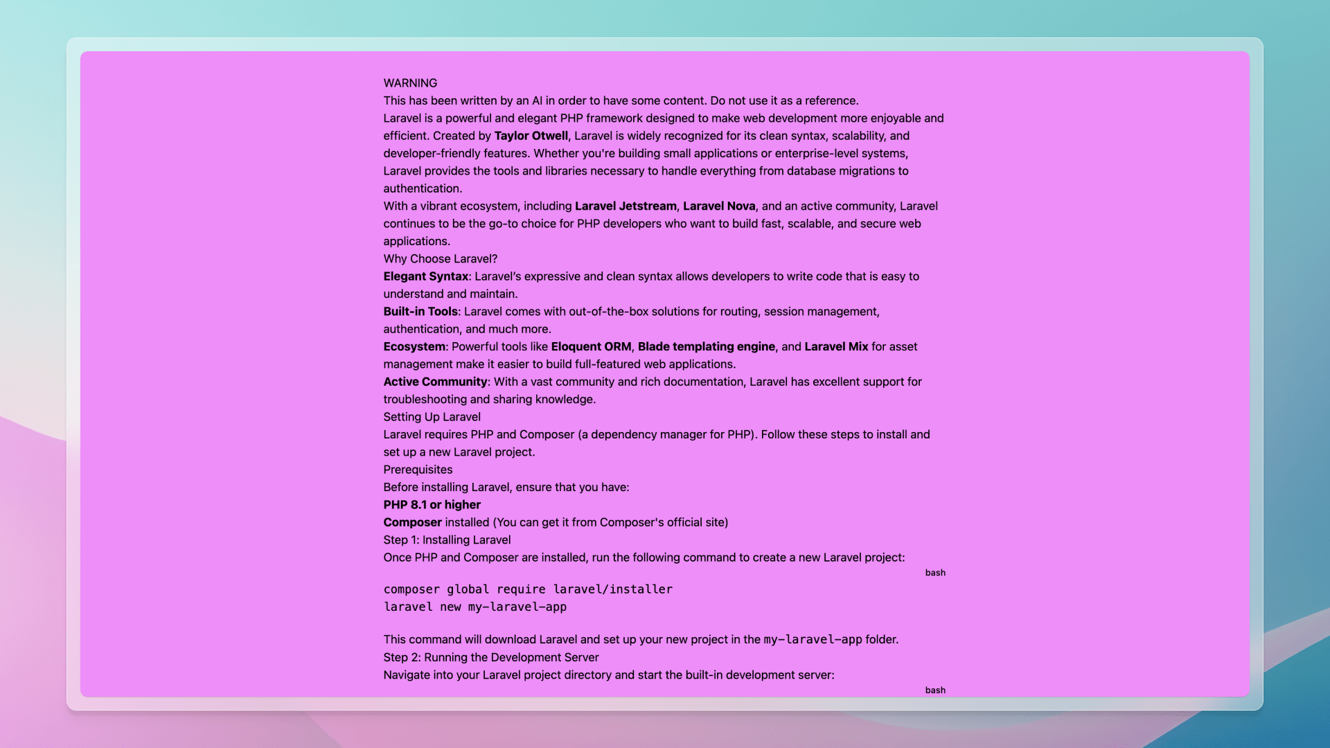
Now, upon navigating to http://localhost:3000/blog/getting-started-with-laravel, you should see the article's content. It's not very elegant, but it functions!

A Table of Contents
To enhance article readability, we can incorporate a table of contents. This will enable readers to navigate the article swiftly. VitePress includes a built-in MarkdownIt plugin for this purpose, and adding a table of contents to a Markdown file is as easy as [[toc]].
Under the warning of each Markdown file, add the following:
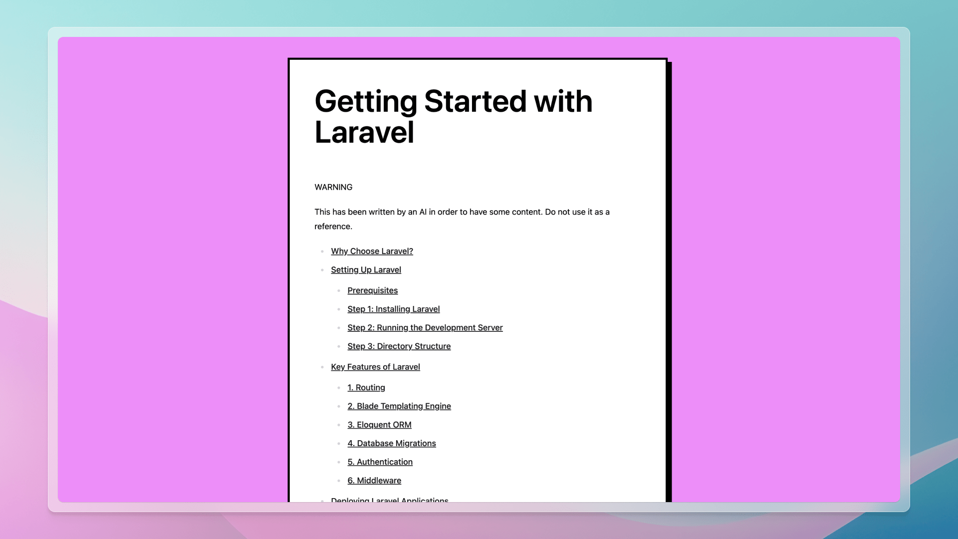
[[toc]]After saving the file, we should observe the table of contents displayed in the article.
Typography
Our content is present but appears unreadable. We can improve this by applying styles to the content. This can be executed manually, but it's quite tedious. There are numerous aspects to consider: font size, line height, margins, padding, colors, etc. Additionally, we must think of every HTML element: headings, paragraphs, lists, blockquotes, tables, code blocks, etc., and how they are nested or positioned together. Fortunately, Tailwind CSS includes a plugin called Tailwind Typography that handles this for us.
The official Tailwind CSS Typography plugin provides a set of prose classes you can use to add beautiful typographic defaults to any vanilla HTML you don’t control, like HTML rendered from Markdown, or pulled from a CMS.
In three steps, we can achieve beautiful typography:
- Install the plugin:
pnpm add -D @tailwindcss/typography- Add the plugin to the
tailwind.config.jsfile:
module.exports = {
  // ...
  plugins: [
    require('@tailwindcss/typography'),
  ],
}- Apply the classes to the
Contentcomponent in theBlogShow.vuefile:
<template>
  <Content class="prose" />
</template>
Tip
The prose class is a Tailwind Typography utility that applies styles to the content.

Now, let's add the title and enhance styles for a polished article.
<script lang="ts" setup>
const { frontmatter } = useData()
</script>

<template>
  <article
    class="mx-4 border-4 border-black bg-white p-8 shadow-[8px_8px_0_black] space-y-16 md:p-12"
  >
    <h1 class="text-6xl font-semibold">
      {{ frontmatter.title }}
    </h1>

    <Content class="text-black prose prose-zinc" />
  </article>
</template>
Code Syntax Highlighting
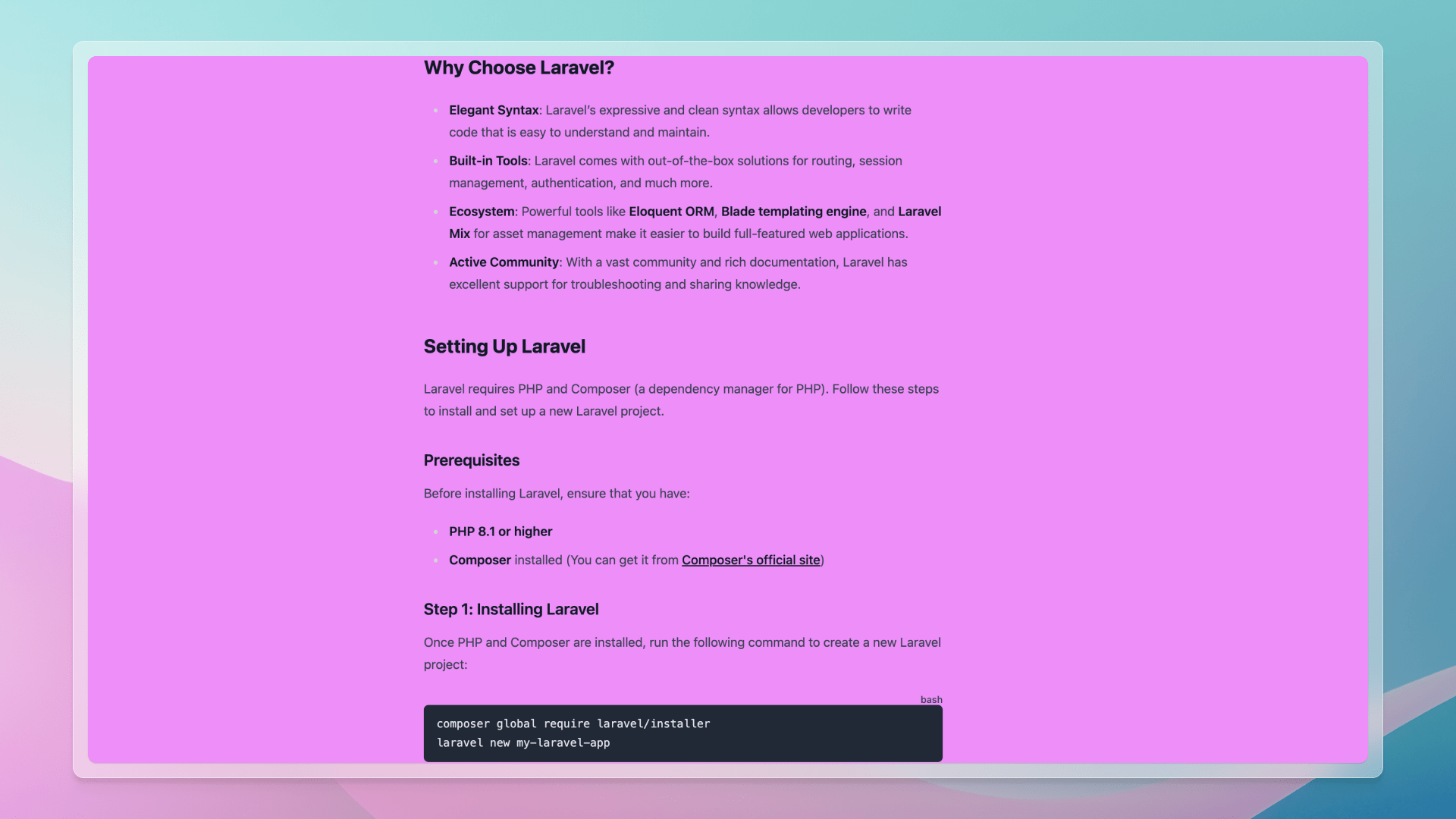
Inspecting the code blocks in the article, we notice the absence of syntax highlighting.
Let's examine the generated HTML to understand the issue:
<div class="language-bash vp-adaptive-theme">
  <button title="Copy Code" class="copy"></button>
  <span class="lang">bash</span>
  <pre class="shiki shiki-themes github-light github-dark vp-code" tabindex="0">
    <code>
      <span class="line">
       <span style="--shiki-light:#6F42C1;--shiki-dark:#B392F0;">composer</span>
        <span style="--shiki-light:#032F62;--shiki-dark:#9ECBFF;"> global</span>
        <span style="--shiki-light:#032F62;--shiki-dark:#9ECBFF;"> require</span><span style="--shiki-light:#032F62;--shiki-dark:#9ECBFF;"> laravel/installer</span>
      </span>
      <span class="line">
        <span style="--shiki-light:#6F42C1;--shiki-dark:#B392F0;">laravel</span>
        <span style="--shiki-light:#032F62;--shiki-dark:#9ECBFF;"> new</span>
        <span style="--shiki-light:#032F62;--shiki-dark:#9ECBFF;"> my-laravel-app</span>
      </span>
    </code>
  </pre>
</div>
Typically, the code block would be rendered as a pre tag with a code tag inside. However, VitePress wraps the code block to incorporate the copy code button and the language. This is achieved by a custom MarkdownIt plugin.
Simultaneously, we notice that colors are applied using CSS variables, with --shiki-light and --shiki-dark variables. For our blog, only one color theme is necessary. Let's change the theme to everforest-light in the VitePress configuration file config.mts:
Tip
You can explore all themes on the Shiki Themes website.
import { defineConfig } from 'vitepress'

export default defineConfig({
  markdown: {
    theme: 'everforest-light',
  },
})
The browser will automatically refresh, and the code blocks will be syntax highlighted.
We are not done yet. Upon examining these blocks closely, there is a substantial margin around them, and the language is incorrectly displayed.
To address this, create a file code.css in the .vitepress/theme/styles directory:
div[class*="language-"] {
  position: relative;
  margin: 1.75em 0;
}

div[class*="language-"] > button.copy {
  display: none;
}

div[class*="language-"] > span.lang {
  position: absolute;
  top: -1.25rem;
  right: 0px;
  z-index: 2;
  font-size: 12px;
  font-weight: 500;
}
For this blog, we removed the code copy button and positioned the language on the top right of the code block. We also set the margin around the div, the outermost HTML element, to overlap with other elements' margins properly.
Tip
If you need the code copy button, you can replicate the styles from the VitePress theme, adapt them, and incorporate them into the code.css file. It's straightforward since the functionality already exists.
Next, import this CSS file in the index.ts file:
// ...

import './styles/app.css'
import './styles/code.css'

// ...
Finally, update our prose to remove some margin around the pre tag and align them with our theme:
/** @type {import('tailwindcss').Config} */
module.exports = {
  content: ['./src/**/*.md', './.vitepress/theme/**/*.{vue,ts}'],
  theme: {
    extend: {
      typography: {
        DEFAULT: {
          css: {
            code: {
              'backgroundColor': '#fdf6e3',
              'padding': '0 0.25rem',
              'borderRadius': '0',
              '&::before': {
                content: '""!important',
              },
              '&::after': {
                content: '""!important',
              },
            },
            pre: {
              'background-color': '#fdf6e3',
              'border-radius': '0',
              'border': '2px solid black',
              'margin': '0',
            },
          },
        },
      },
    },
  },

  plugins: [require('@tailwindcss/typography')],
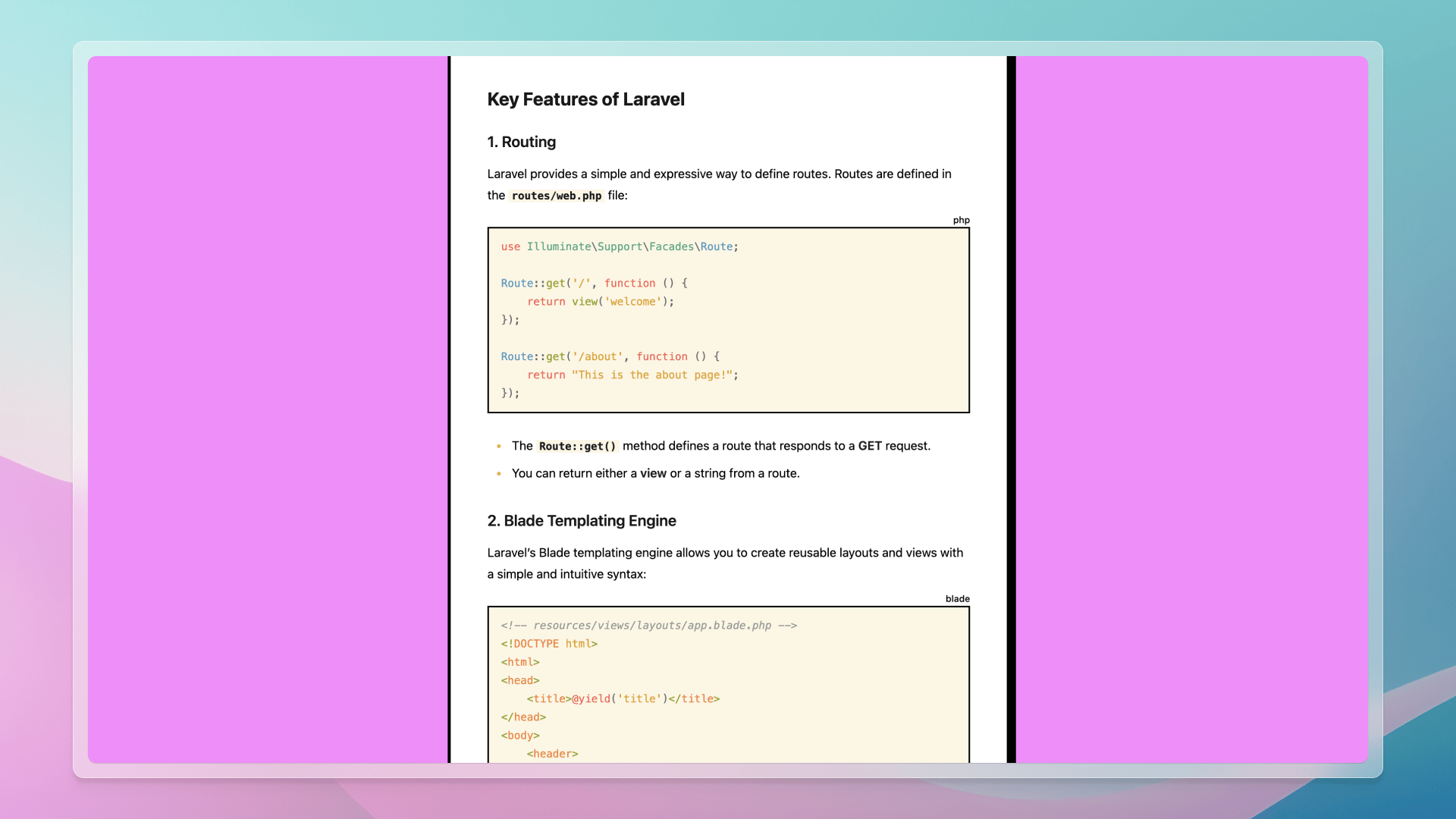
}Now, the code blocks are syntax highlighted and styled according to our theme. 🎨
Alerts
At the beginning of each article, I added an alert to inform the reader that the content is AI-generated. It's not educational material, merely placeholder text more realistic than the traditional "Lorem Ipsum" text.
By default, VitePress understands GitHub Flavored Markdown Alerts. Like the copy button, you can simply copy the styles from the VitePress theme and adjust them to your preferences. But I find them unsatisfactory, so we'll disable them and implement another plugin.
First, let's install the plugin:
pnpm add -D markdown-it-github-alertsThen, disable the default plugin and connect the new one in the config.mts file:
import MarkdownItGitHubAlerts from 'markdown-it-github-alerts'
import { defineConfig } from 'vitepress'

export default defineConfig({
  // ...

  markdown: {
    config(md) {
      md.use(MarkdownItGitHubAlerts)
    },
    gfmAlerts: true,

    theme: 'everforest-light',
  },

  // ...
})
Through the config function, we have full control over the MarkdownIt instance used by VitePress. We can add and configure any plugin we want. 🤌
Now, incorporate the styles to the index.ts file, after our custom CSS:
// ...

import 'markdown-it-github-alerts/styles/github-base.css'
Our alerts are now well-formatted but not colored. We could include another CSS file for colors, but I prefer custom colors for this theme.
Let's create another file called alerts.css in the .vitepress/theme/styles directory:
:root {
  --color-note: #3a85ff;
  --color-tip: #00ddb3;
  --color-warning: #ffbf00;
  --color-severe: #ff7002;
  --color-caution: #f34720;
  --color-important: #8746ff;
}
This file specifies some CSS variables with colors for the alerts. Import this file in the index.ts file:
// ...

import './styles/app.css'
import './styles/code.css'
import './styles/alerts.css'

// ...
Now, our alerts are colored according to our theme. 🌈
Back to the Blog
It would be beneficial to have a button to return to the blog index at the end of the article. We can easily add this by copying the button from the BlogIndex.vue file and pasting it at the end of the BlogShow.vue file:
<script lang="ts" setup>
// ...
</script>

<template>
  <!-- ... -->

  <div class="mt-16 flex justify-center">
    <a
      href="/"
      class="border-4 border-black bg-[#FFEB00] px-8 py-4 shadow-[4px_4px_0_black] transition duration-150 ease-linear hover:bg-[#fff90d] hover:shadow-[6px_6px_0_black] hover:-translate-x-[0.125rem] hover:-translate-y-[0.125rem]"
    >
      Back to Blog
    </a>
  </div>
</template>
Some Refactoring
I don't like copying a button from one file to another. If we want to change the button's color, we must update it in multiple places.
First, we will centralize our colors in the app.css file:
// ...

:root {
  --color-yellow: #ffbf00;
  --color-sand: #fdf6e3;
}
Then, we can refactor this button in a ButtonPrimary.vue component within the .vitepress/theme/components directory:
<template>
  <a
    href="/"
    class="border-4 border-black bg-[var(--color-yellow)] px-8 py-4 shadow-[4px_4px_0_black] transition duration-150 ease-linear hover:bg-[#ffdf1b] hover:shadow-[6px_6px_0_black] hover:-translate-x-[0.125rem] hover:-translate-y-[0.125rem]"
  >
    <slot />
  </a>
</template>
And update our BlogShow.vue and BlogIndex.vue files to utilize this new component:
<template>
  <!-- ... -->

  <div class="mt-16 flex justify-center">
    <ButtonPrimary href="/blog">
      Back to Blog
    </ButtonPrimary>
  </div>
</template><template>
<section>
<!-- ... -->
<div class="flex justify-center">
<ButtonPrimary href="/">
Back to Home
</ButtonPrimary>
</div>
</section>
</template>Let’s update our alerts.css file to utilize the newly created CSS variable:
:root {
  --color-note: #3a85ff;
  --color-tip: #00ddb3;
  --color-warning: var(--color-yellow);
  --color-severe: #ff7002;
  --color-caution: #f34720;
  --color-important: #8746ff;
}
To enhance our content, let’s add some colors to the prose by customizing the tailwind.config.js file:
/** @type {import('tailwindcss').Config} */
module.exports = {
  // ...
  theme: {
    extend: {
      typography: {
        DEFAULT: {
          css: {
            'ul > li': {
              '--tw-prose-bullets': 'var(--color-yellow)',
            },
            'hr': {
              'border-top': '2px solid var(--color-yellow)',
            },
            // ...
          },
        },
      },
    },
  },

  // ...
}Thanks to our CSS variable, customization is seamless!
In the Layout.vue file, transform pt-16 to py-16 to add padding on both the top and bottom and prevent the button from touching the screen's bottom border:
<template>
  <div class="min-h-screen bg-[#FC88FF] py-16">
    <!-- ... -->
  </div>
</template>
And we're finished! 🎉
I hope this article was enjoyable and conveyed how open to customization VitePress is.
Thanks for reading! My name is Estéban, and I love to write about web development and the human journey around it.
I've been coding for several years now, and I'm still learning new things every day. I enjoy sharing my knowledge with others, as I would have appreciated having access to such clear and complete resources when I first started learning programming.
If you have any questions or want to chat, feel free to comment below or reach out to me on Bluesky, X, and LinkedIn.
I hope you enjoyed this article and learned something new. Please consider sharing it with your friends or on social media, and feel free to leave a comment or a reaction below, it would mean a lot to me! If you'd like to support my work, you can sponsor me on GitHub!
Discussions
Add a Comment
You need to be logged in to access this feature.