Creating a Playground and a Storybook for Components
Part of the series The Complete Guide to Building a Vue.js Component Library
We have components and tests, but until now, we've been unable to see them in action. It's time to create a playground for two key reasons:
- Testing: We need to test our components in a real environment to ensure they work as expected. Writing a page with all components, their props, and slots helps create the best API and implement it efficiently. This approach minimizes frequent refactoring by providing a comprehensive view of the components.
- Visualizing: Visualizing components is essential. While Tailwind CSS simplifies styling, it's impossible to fully grasp a component through code, especially complex ones with numerous variants or slots. A playground allows us to see components in action and test them in various scenarios.
Setting Up the Playground
First, create a new folder named playground at the root of your project.
mkdir playgroundThen, create a new Vite project in this folder, which will depend on our component library. Being in a monorepo simplifies this process.
cd playground && pnpm create vite --template vue-tsName this project vue.
Before installing dependencies, update the pnpm-workspace.yaml to include the playground/vue package. This allows the playground to access the component library.
packages:
  - 'packages/*'
  - 'playground/*'
Install the playground dependencies:
pnpm installIn this Vue.js playground, remove unnecessary files, folders, and content:
rm -rf .vscode .public src/{assets,components}
echo "<template></template>" > src/App.vue
echo "" > src/style.css
Remove the .vscode folder, public folder, assets and components folders in src, and the content of App.vue and style.css.
Now, install the component library in the playground:
pnpm add ../../packages/huchet-vueThis command installs the component library by creating a symlink to it in node_modules. Thus, any import made in the playground resolves to the component library in the monorepo, allowing real-time changes during development.
Start the watch script in the huchet-vue package folder and the dev script in the playground/vue folder. Any change in the component library will reflect in the playground.
Using the Playground
With the component library installed in the playground, you can start using it.
In the src/App.vue file, import the Button component and use it:
<script lang="ts" setup>
import { Button } from '@barbapapazes/huchet-vue'
</script>

<template>
  <div class="flex gap-6 p-6">
    <Button label="Hello World" />
    <Button label="Hello World" variant="outline" />
  </div>
</template>
To view the result, start Vite in the playground:
pnpm devThen, start Vite in the component library:
pnpm watchImportant
The more components your library has, the longer it will take to reflect changes in the playground. If it starts to slow down, consider directly importing the component from the library with a relative path or using a storybook like Histoire, which we'll cover next.
In your browser, you should see two buttons, unstyled.

Styling the Playground
Our components are unstyled. To reduce bundle size and allow user-side generation, we don't deliver CSS with the component library.
Note
We could ship a Tailwind CSS configuration with the component library to ensure components are styled correctly in the playground.
We will use Tailwind CSS 4, even though it's not released yet, because it comes with a Vite plugin that simplifies usage and no more breaking changes are expected.
pnpm i -D tailwindcss@next @tailwindcss/vite@nextThen, register the Tailwind CSS plugin in the vite.config.ts file:
import Tailwindcss from '@tailwindcss/vite'
import Vue from '@vitejs/plugin-vue'
import { defineConfig } from 'vite'

export default defineConfig({
  plugins: [
    Vue(),
    Tailwindcss(),
  ],
})
In the src/style.css, import Tailwind CSS styles:
@import "tailwindcss";Automatically, the buttons are styled as expected.

The Storybook Histoire
Sometimes a playground isn't enough. You need to document your components, visualize them in various scenarios, and isolate them to ensure issues stem from the component, not integration. This is where a storybook comes in.
We will use Histoire, a Storybook-like tool that's lightweight, based on Vite, and optimized for Vue.js.
Setting Up Histoire
Setting up Histoire is simple, especially with Tailwind CSS 4.
First, create a new folder from the root of the project:
mkdir .histoire && cd .histoire && echo '{\n"name": "huchet-vue-histoire",\n"private": true\n}' > package.jsonNote
I placed the Histoire folder at the project root instead of the packages folder because it's a development tool, not a publishable npm package.
Add the folder to the workspace:
echo " - .histoire" >> ../pnpm-workspace.yamlInstall Histoire and Tailwind CSS:
pnpm i -D histoire @histoire/plugin-vue @vitejs/plugin-vue vue tailwindcss@next @tailwindcss/vite@nextNote
We install Tailwind CSS now because we'll need it, as seen in the playground.
Histoire uses a configuration file named histoire.config.ts, which we'll create in the .histoire folder:
touch histoire.config.tsThe configuration includes multiple keys:
plugins: Plugins for Histoire, such as the Histoire Vue plugin.storyMatch: Files to match for creating stories, like the*.story.vuefiles.setupFile: Setup file to use with Histoire, where we'll create asetup.ts.theme: Personalization options like title, logo, favicon for the Histoire interface.vite: Vite configuration utilizing the Vue and Tailwind CSS plugins.
import { resolve } from 'node:path'
import { HstVue } from '@histoire/plugin-vue'
import Tailwind from '@tailwindcss/vite'
import Vue from '@vitejs/plugin-vue'
import { defineConfig } from 'histoire'

export default defineConfig({
  plugins: [HstVue()],

  storyMatch: [
    resolve(__dirname, '../packages/huchet-vue/src/**/*.story.vue'),
  ],

  setupFile: resolve(__dirname, 'setup.ts'),

  theme: {
    title: 'Huchet Vue',
  },

  vite: {
    plugins: [
      Vue(),
      Tailwind(),
    ],
    server: {
      fs: {
        allow: ['..'],
      },
    },
  },
})Since the stories are in the component library, we must explicitly instruct Histoire to look for them in the packages/huchet-vue/src folder using the storyMatch key. Meanwhile, we permit the Histoire server to access the parent folder via the server.fs.allow key, preventing file accessibility issues.
To implement Tailwind CSS in Histoire, import the CSS in the setup.ts file, similar to the playground:
touch setup.ts style.css
echo "import './style.css';" > setup.ts
echo "@import 'tailwindcss';" > style.css
Note
The setup.ts file is executed on Histoire's startup and is an ideal place for personalization or global styles.
To begin with Histoire, add three scripts to the package.json:
{
  "scripts": {
    "dev": "histoire dev",
    "build": "histoire build",
    "serve": "histoire serve"
  }
}
Now, we can start Histoire:
pnpm dev
Creating a Story
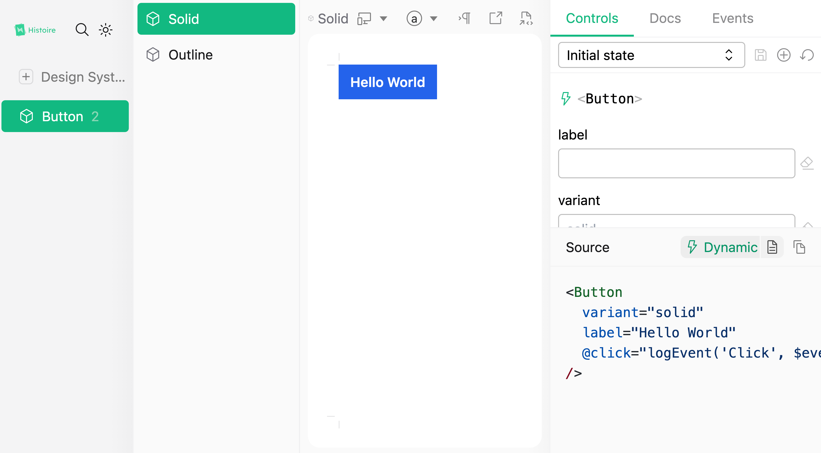
Returning to packages/huchet-vue, we can create our first story file, Button/Button.story.vue:
touch src/Button/Button.story.vueHistoire offers predefined components for crafting a story with variants.
Story: The main component for creating a story.Variant: A component to create a variant of a component within the story.
In our scenario, we create a story in Button.story.vue with two variants: solid and outline.
<script lang="ts" setup>
import { logEvent } from 'histoire/client'
import Button from './Button.vue'
</script>

<template>
  <Story>
    <Variant title="Solid">
      <Button variant="solid" label="Hello World" @click="logEvent('Click', $event)" />
    </Variant>
    <Variant title="Outline">
      <Button variant="outline" label="Hello World" @click="logEvent('Click', $event)" />
    </Variant>
  </Story>
</template>
Note
The logEvent function logs events in the interface, aiding developers in understanding the component's output.
And it works!

However, a major issue persists: the Story and Variant components are not recognized by our editor.
Adding Histoire Types
Fortunately, we can resolve this issue easily as Histoire provides the necessary tools.
Histoire introduces a new TypeScript context within our project, so we need to create a new TSConfig file in the packages/huchet-vue folder:
touch tsconfig.story.jsonThis file extends tsconfig.app.json but captures only the story.vue files and a new histoire.d.ts file:
{
  "extends": "./tsconfig.app.json",
  "compilerOptions": {
    "moduleResolution": "node"
  },
  "include": [
    "histoire.d.ts",
    "src/**/*.story.vue"
  ],
  "exclude": []
}
Note
The moduleResolution option is vital for accurate module resolution. The @vue/tsconfig package uses Bundler, but we need Node for our use case. Ensure "exclude": [] overwrites the exclude option in tsconfig.app.json.
Create the histoire.d.ts file:
touch histoire.d.tsReference Histoire's types in this file:
/// <reference types="@histoire/plugin-vue/components" />Register the new TSConfig in the tsconfig.json:
{
  "files": [],
  "references": [
    {
      "path": "./tsconfig.app.json"
    },
    {
      "path": "./tsconfig.node.json"
    },
    {
      "path": "./tsconfig.story.json"
    }
  ]
}
Update tsconfig.app.json with an exclude option to avoid overlapping TSConfig capture:
{
  "extends": "@vue/tsconfig/tsconfig.dom.json",
  "include": [
    "src/**/*.ts",
    "src/**/*.vue"
  ],
  "exclude": [
    "src/**/*.story.vue"
  ]
}
Note
Overlapping TSConfig captures can lead to unexpected behavior and numerous issues. Ensure clear boundaries between TSConfigs to avoid conflicts.
In the next article, we will enhance integration with the Vue.js ecosystem by creating a resolver for Unplugin Vue Component and a Nuxt module.
Thanks for reading! My name is Estéban, and I love to write about web development and the human journey around it.
I've been coding for several years now, and I'm still learning new things every day. I enjoy sharing my knowledge with others, as I would have appreciated having access to such clear and complete resources when I first started learning programming.
If you have any questions or want to chat, feel free to comment below or reach out to me on Bluesky, X, and LinkedIn.
I hope you enjoyed this article and learned something new. Please consider sharing it with your friends or on social media, and feel free to leave a comment or a reaction below, it would mean a lot to me! If you'd like to support my work, you can sponsor me on GitHub!
Discussions
Add a Comment
You need to be logged in to access this feature.